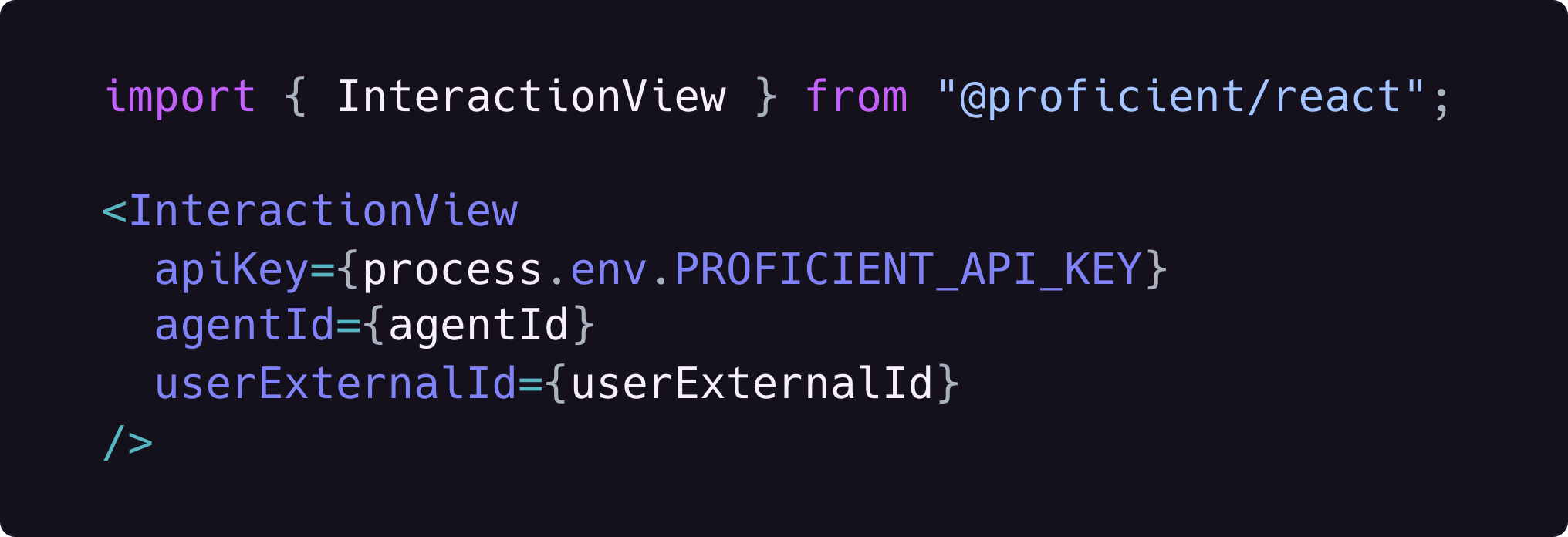
InteractionView, which can be themed
and customized to your application’s needs.
Installation
You can install the React SDK via npm or Yarn.Quickstart
You can connect your application to Proficient AI in just a few minutes.Prerequisite: Make sure you’ve created and activated an agent before
proceeding further. See creating my first agent for more
details.
- Next.js
- Other React
Copy the publishable API key associated with your project from Project Settings.
Add it as a
NEXT_PUBLIC_PROFICIENT_API_KEY environment variable to your app.Now add the InteractionView component to the page where you want your users to interact
with your agent.userExternalId variable above simply refers to the unique ID of your user. For
more details see User External ID.
InteractionView
A chat interface component that allows your users to interact with your Proficient AI agent.
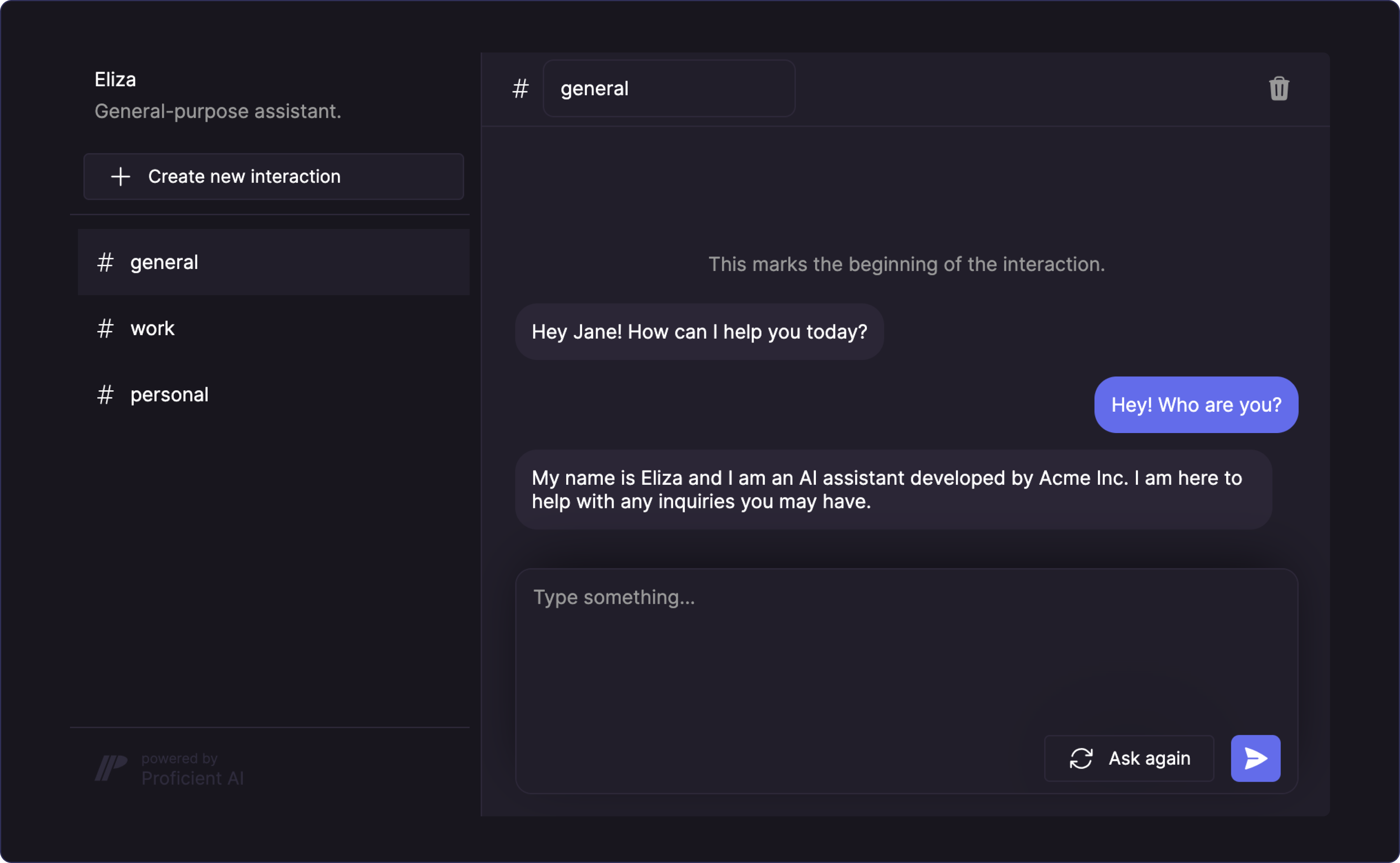
This is currently the only component that the React SDK offers. Let us
know if you need other types of components.
We’d love to support your use case!
Props
The publishable API key associated with your project. This can be found in the
admin dashboard.
The unique ID of the agent. This can be found in the admin dashboard.
The unique ID of the user within your system. See User External
ID for more details.
Either the HMAC hash for the given user or a function that returns a Promise
resolving to the HMAC hash. This is required if the project has HMAC
authentication enabled. Internally, the component caches the HMAC hash so that
it is not computed on every render. See HMAC
Authentication for more details.
The type of the chat interface layout.
"casual": looks like iMessage/WhatsApp."formal": looks like ChatGPT.
Chat section height in pixels. Must be greater than or equal to 240.
Header section height in pixels. Must be greater than or equal to 54.
If set to
true, sending a message to the agent will automatically trigger an
Ask request and the agent will reply to the
message. This is the intuitive option but if you disable it, users will be
able to send multiple messages before asking for a reply.If set to
true, pressing Enter will send the current text input as message.The placeholder for the text area.
The theme object including your brand colors. Can be created with the
createTheme(params) factory function. See custom themes
for more details.Custom themes
You can use a custom theme to preserve your brand identity and ensure that the component interface matches the rest of your application. Custom themes can be created with thecreateTheme(params) factory function which currently
takes three colors as parameters. We then dynamically compute the rest of the colors that
the component uses based on these three values.
theme prop.